
Lark Onboarding Section
As a designer at Lark, I am primarily responsible for the Onboarding section. I need to complete the page design and interactions within the framework of the existing design specifications, ensuring that the product meets its intended goals. During the project iteration process, I continually optimize the design through data feedback to achieve maximum user impact.
In addition, it is essential to closely collaborate with other regional teams during the design process to ensure that new features can be smoothly integrated and seamlessly connected with the functionalities of other business lines.
Role
Full process
Field
Utility software
Project
Web pages, Apps, Operations
Part #1
Web Reg Process
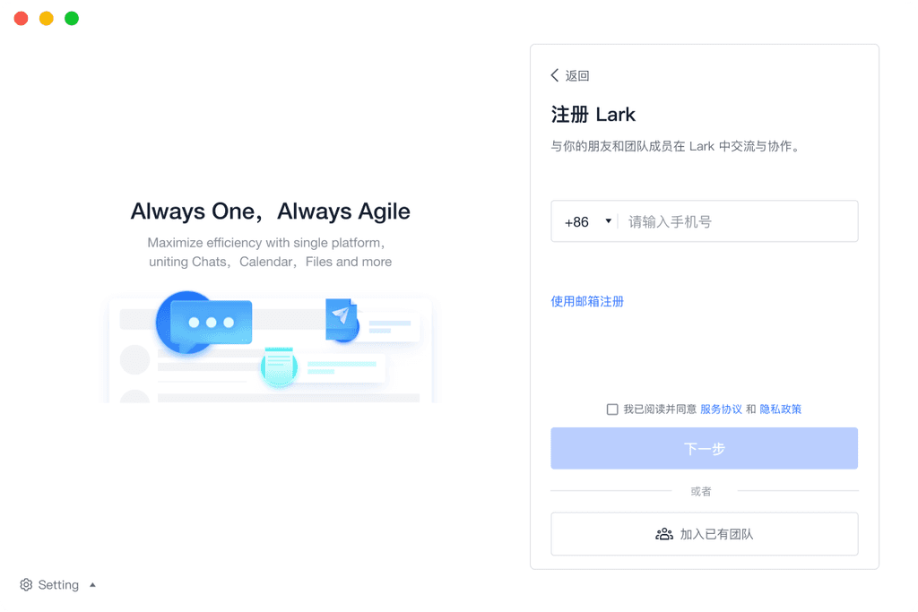
In the registration process optimization project, I conducted user testing combined with existing design specifications to deeply analyze and adjust the key stages of the process, aiming to reduce user churn and enhance the overall experience. Based on testing data and user feedback, I identified and resolved the confusion users faced when creating new accounts and joining existing teams, effectively preventing duplicate accounts within the same company team and optimizing the accuracy and convenience of the user journey.
In terms of visual design, I integrated the overall brand style, cleverly utilizing the brand illustration system and brand selling points to ensure that the registration interface is not only visually consistent but also conveys the brand's core values. Specific design improvements include stabilizing the position of the input fields to avoid unnecessary shaking, making the transition between each step smooth and natural, thereby enhancing the usability of the process and the user's trust in the product.


The multi-tenant switching page is one of the more complex parts of this module, covering the display of teams the user has joined as well as other teams that can be joined, all while presenting this content within a fixed window height. To ensure that users can accurately select among multiple options, I meticulously differentiated the interface elements to reduce the risk of user errors.
During the design process, we verified various interaction schemes through multiple rounds of user testing to ensure that users can quickly and accurately complete actions when switching tenants. This design effectively balances functionality and usability, providing users with a clearer experience in multi-tenant management.
Delivery results
The tenant switch error rate has decreased from the original 11% to 2%
The number of pages has been optimized from 3 pages to 1 page, avoiding multiple redirects, while also allowing users to better understand the differences between tenants through the card.
Part #2
Web Login Process
When designing the login page, it is important to clearly present the disclaimer agreement, email/phone login options, and the registration entry, ensuring that each function is clearly distinguishable. Ultimately, by using the proximity principle, the content is divided into two parts: one part focuses on the main operations of the page (such as the login input fields), while the other part provides supplementary information (such as the disclaimer agreement).
The main operation items are located near the input fields, while the supplementary information is placed at the title position to keep the interface tidy and easy to understand. This design enables users to easily find the functions they need, enhancing the overall intuitiveness and operability of the page.


After the user clicks on the QR code login entry on the login page, they will enter the QR code login page. Through two icons, users can seamlessly switch between different login methods. This design not only conforms to the user's operational habits but also ensures visual consistency, enhancing the overall smoothness and usability of the experience.
At the same time, the design highlights the differences between the login and registration processes, achieving a significant distinction between the two processes through two different colors and a left-right layout.
Part #3
Client-Side Process
The client login and registration process is encapsulated based on the web version, adding features for automatic login and settings, while making improvements on the basis of the original layout.
At the same time, to ensure the distinction of the client design from the web version, a visual style that aligns with the brand's tone is created on a white background to enhance brand recognition and consistency.


The client login and registration process is encapsulated on the Web side, with added features for automatic login and settings, while improving upon the original layout.
At the same time, to ensure the differentiation of the client design from the Web side, a visual style that aligns with the brand tone is created based on a white background, enhancing brand recognition and consistency.
Part #4
Mobile Process
In the mobile login and registration process, we make adjustments based on the client version and strictly adhere to the HIG specifications to ensure compliance with mobile user experience standards.
By intelligently recognizing phone numbers, the system automatically matches the appropriate process for user login or registration, reducing unnecessary repetitive actions and the risk of mistakes.
The design further refines the presentation of interface information, maintaining consistency between the client and mobile platforms, while enhancing the convenience and smoothness of operations, striving to provide users with a more natural and seamless experience.


Part #5
Third-party Authorized Login
In the design of third-party authorization login, we have further enhanced its visual difference from the conventional login and registration process by adjusting the design and style while maintaining the original operating specifications.
By adjusting visual elements such as color, button shape, and position, users can quickly and intuitively recognize and operate when choosing third-party authorization login.

Part #6
Help Center
In the design of the help center, the focus is on enabling users to quickly find the information they need. Therefore, we adopt a clear and concise classification system to ensure that the content is well-organized and easy to search.
At the same time, through reasonable visual design, we strengthen clarity and readability. The page layout is kept as simple and fresh as possible, highlighting a distinctly hierarchical classification structure to avoid users getting lost among numerous categories and details. To enhance user experience, subtle colors and visual separations are used between categories, allowing users to quickly identify and navigate, thereby improving search efficiency.


On the secondary page, the tab tool allows for quick switching between different themes, enabling users to quickly locate the desired content.
Detailed help content is displayed in a document-like format, combining titles and card designs to enhance the clarity and visibility of issues, making it more suitable for search engine optimization.
The content of each article is organized in paragraph structure, enhancing reading fluency and information retrieval efficiency, allowing users to better understand the overall content and quickly find the specific information they need.
In the secondary pages, different themes can be quickly switched through the tab tool, allowing users to quickly locate the content they need.
Detailed help content is presented in a document-like format, combining titles and card design, which enhances the clarity and visibility of issues, and is also more suitable for search engine optimization.
The content of each article is organized by paragraph structure, improving reading fluency and information retrieval efficiency, allowing users to better understand the overall content and quickly find the specific information they need.
